
Learn how the social media affects society and environment
January 12, 2017The experience of our primary mobile screen being a bank of app icons that lead to independent destinations is dying. And that changes what we need to design and build.
How we experience content via connected devices – laptops, phones, tablets, wearables – is undergoing a dramatic change. The idea of an app as an independent destination is becoming less important, and the idea of an app as a publishing tool, with related notifications that contain content and actions, is becoming more important. This will change what we design, and change our product strategy.
No more screens full of app icons
This is such a paradigm shift it requires plenty of explaining. Whilst it may not transpire exactly as I’m about to describe, there is no doubt what we have today — screens of apps — is going to dramatically change. Bear with me as I run through the context.
The idea of having a screen full of icons, representing independent apps, that need to be opened to experience them, is making less and less sense. The idea that these apps sit in the background, pushing content into a central experience, is making more and more sense. That central experience may be something that looks like a notification centre today, or something similar to Google Now, or something entirely new.
The primary design pattern here is cards. Critically it’s not cards as a simple interaction design pattern for an apps content, but as containers for content that can come from any app. This distinction may appear subtle at first glance, but it’s far from it. To understand it, and chart the trajectory, we need to quickly run through two things.
-
Designing systems not destinations
I covered this topic in detail in a previous post, so I’ll quickly summarise here. Most of us building software are no longer designing destinations to drive people to. That was the dominant pattern for a version of the Internet that is disappearing fast. In a world of many different screens and devices, content needs to be broken down into atomic units so that it can work agnostic of the screen size or technology platform. For example, Facebook is not a website or an app. It is an eco-system of objects (people, photos, videos, comments, businesses, brands, etc.) that are aggregated in many different ways through people’s newsfeeds, timelines and pages, and delivered to a range of devices, some of which haven’t even been invented yet. So Facebook is not a set of webpages, or screens in an app. It’s a system of objects, and relationships between them.
-
Recent changes to iOS and Android notifications
Things changed with iOS 8 and Android KitKat. Notifications used to be signposts to go to other places. A notification to tell you to open an app. To open a destination.
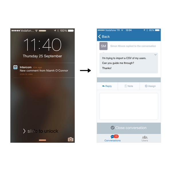
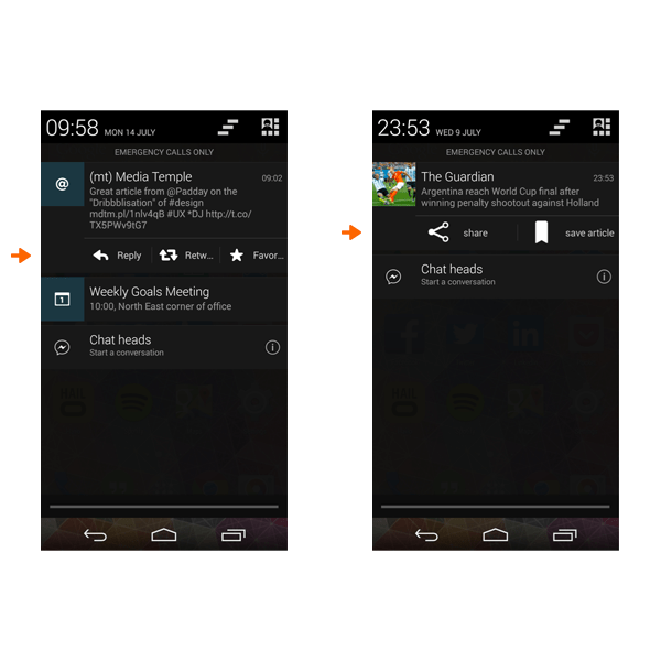
But that is changing fast. For a while now, you can take action directly in Android notifications. Sometimes that takes you to that action in the app itself, but sometimes you can do the action directly, meaning that you don’t need to open the app at all.
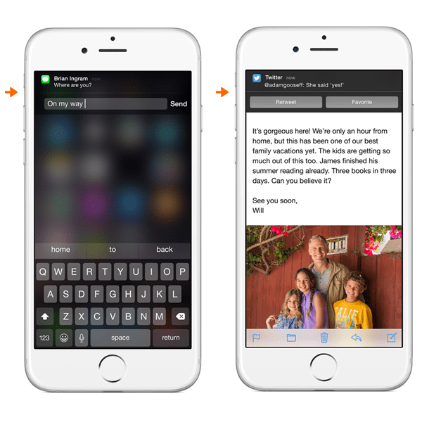
iOS is following suit here and raising the bar. Interactive notifications. No need to open the app. The notification is the full experience.
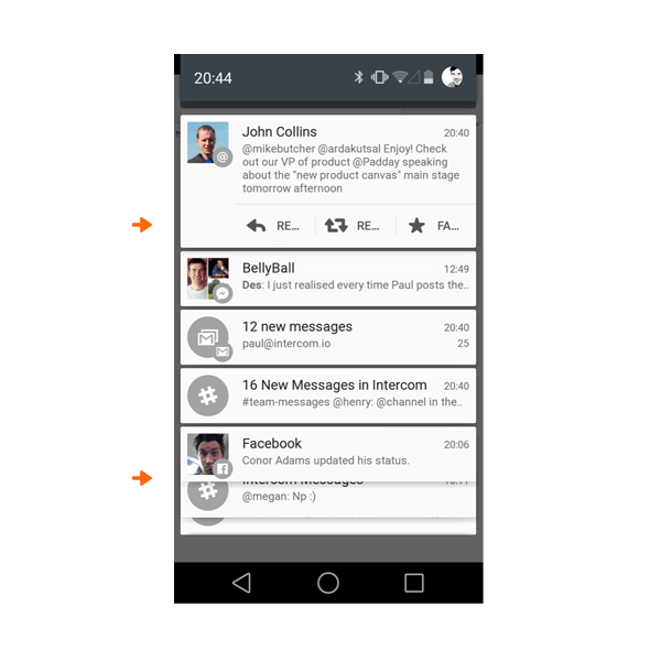
The next version of Android takes this even further, breaking notifications into independent cards. You can see that cards stack below each other.
Next up: cards housing full product experiences
The next iteration is obvious. Lots and lots of notification cards that enable full product experiences and independent workflows right inside the card. Comment on the Facebook post. Retweet the tweet. Buy the item on Amazon. Check in for the flight. Share the news story. Add the reminder to your to-do list. Book the restaurant. Swap the fantasy football player. Annotate the run you just finished. Pay the bill. And on and on.
Towards apps as services
Breaking things right down into the individual atomic unit, including the content and actions. The atomic unit separate from the container of the app itself, so that it can show up anywhere, on any device. The atomic units are then reassembled based on context. Aggregated in a centralised stream. Or pushed to you on your watch.
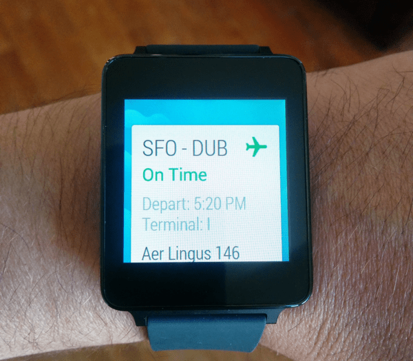
The content may be reformatted to enable more natural user input, optimized for your situation. Des sent me a text based message, but I’m driving so my watch reads it out to me. I speak my reply to Siri/Google and Des receives it as a text based message, because he’s in work at his desk. The actions available change. All this and more is just about to happen.
It may be very likely that the primary interface for interacting with apps will not be the app itself. The app is primarily a publishing tool. The number one way people use your app is through this notification layer, or aggregated card stream. Not by opening the app itself.
In a world where notifications are full experiences in and of themselves, the screen of app icons makes less and less sense. Apps as destinations makes less and less sense. Why open the Facebook app when you can get the content as a notification and take action — like something, comment on something — right there at the notification or OS level. I really believe screens of apps won’t exist in a few years, other than buried deep in the device UI as a secondary navigation.
A concept design to make this concrete
This is such a fundamental shift that to highlight where it may go, I’ll start with a rough system design for how one might interact with a connected device in this world.
– Imagine a vertical stream of cards, individually personalised and ranked based on who and what you care about, your current context (location, availability, etc.) and your likelihood to care about things based on historical data when you were in a similar context.
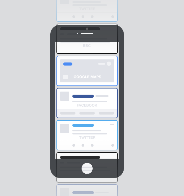
– The cards can come from any source that you care about or have given permission to.
– This looks a lot like Google Now, but on steroids. You will have almost as many unique sources in your stream as you have apps on your phone.
– This also looks a lot like your notifications centre on your phone, but rather than merely signposts to open apps, these cards are notifying you, presenting you with the content to decide what to do next, and with the ability to interact with the content right there and then. So a card from Facebook has all the actions you would have for that content if you viewed it in the Facebook app. Like, comment, share, save, etc. all inline, with no need to open the Facebook app. Cards from travel apps allow you to book, cards from commerce apps allow you to buy, the list is endless.
This is the beginning of the end for apps as destinations. Why open the app when you don’t need to? Let’s take this a step further.
Imagine that you can scroll horizontally, and that shows you more content from the same source. So on a Facebook post, that is effectively your newsfeed presented horizontally rather than vertically.
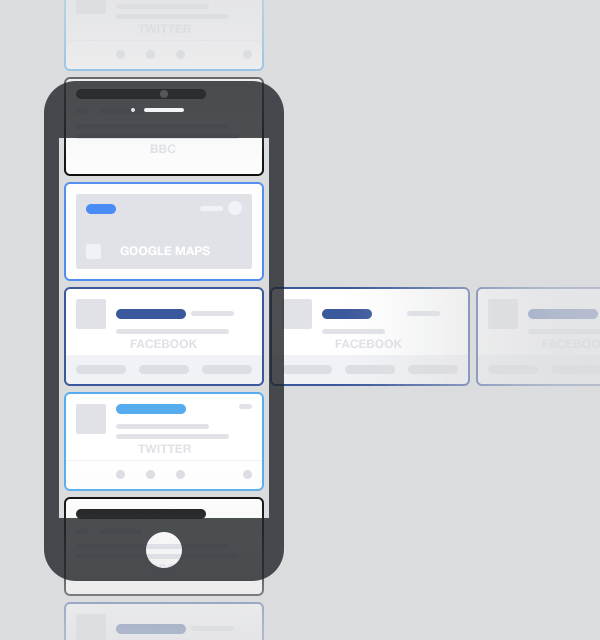
This would be the same for all sources, Twitter, Instagram, WhatsApp, news apps, etc. And of course on all devices.
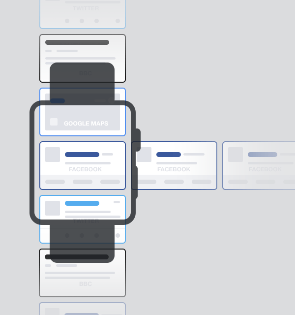
OK now let’s go a step further again.
Imagine that a parent card can support a child card, so for example a Facebook card can support (embed) a card from the BBC. Indeed something similar already exists with Twitter.

This is also a little similar to the recently launched Apple Extensions, and is already happening in app development in China with Baidu and WeChat, where smaller apps are being bundled within bigger apps, only surfacing when some interaction in the UI invokes the smaller app. For example, in Baidu Maps you can find a hotel, check room availability, and make a booking, all inside the app.
But again the apparent subtlety masks something much more profound. Embedded cards (child cards) within cards (parent cards) also mean you don’t need to install the app to experience the content from the child card. You just need the parent card app on your device. Again, this is already happening, Twitter cards currently support Stripe payments inside the card. You don’t need the New York Times app to see their content on Twitter. But imagine this pattern was widespread. Suddenly app developers have a powerful discovery channel. And some businesses may be comfortable always appearing as a child card, without ever having an app at all.
One final step further. What if the cards came from other things ? Like vending machines that you walk up to and pay through the card? Hotels you walk into and order your breakfast or pay for the wifi?
The ramifications for websites might also be huge. If a publishing company, for example the New York Times, can push content to cards, and those cards can be seen in many different third party places (with revenue sharing agreements) why bother having a website at all? It’s just a huge overhead.
We will still open apps. Sometimes
In this world, it feels dumb to open apps just to see what lies behind the red counter, or to have to switch between apps. Opening apps is still necessary and great for many contexts, especially composition of new content and dedicated deep workflows, and maybe changing preferences. But not for seeing what’s new and interesting. A bank of app icons as a dominant design pattern feels old and inefficient now, and I think it’ll disappear within a couple of years, correctly relegated behind a “show me my apps” action.
The system will learn, creating new competitors
As people interact or don’t interact with cards presented to them, the system will learn when to show more or less from a specific source (app). As content from different apps will be presented side by side, this changes who you might think you are competing with. Competition is between products that do the same job, not products that are in the same category. This is already the case today; when faced with multiple notifications on a phone screen, they all compete with each other for your attention.
Here at Intercom, we’re big proponents of the Jobs To Be Done (JTBD) framework, which asks what Job people need to get done that your product fulfills. If you focus purely on the job, and not the industry, you realise airlines selling business class seats are competing with Skype for customers, as they address the same job: the need to have clear communication with colleagues.
Similarly, apps will realise they are competing on Jobs they may not have realised their product addresses. Twitter for example, may be competing much more with apps addressing the Job of ‘entertain me while I have a short amount of free time’ e.g. Games and News apps, than with other social products.
This intense competition means businesses will have to spend time designing great notifications/cards, because they will potentially be competing with cards from Facebook, or Amazon, or Google. The days of sending lots and lots of notifications to bring people back to an app are going away, with a much better focus on designing notifications that people engage with there and then, independent of opening the app.
Three critical questions
There are many signs pointing towards a near future that looks something like this. But many questions remain — these are three that I have no answers for:
- Will this happen at the app, notification, or OS level?
One of the biggest challenges will be whether these experiences will occur:
- at an app level (like an evolution of Google Now),
- at a notification level (an evolution of the Android or iOS notification centre),
- or at the root OS level (a redesigned iOS for example that removes the sea of app icons).
- Will this be one consolidated stream, or multiple streams?
Maybe we will have a friends stream, a news stream, a work stream.
- Will this be owned at a company level?
Maybe there will be a Google version, an Apple version, etc. Or more open systems that are interoperable across platforms (like the web itself), the first of which are being built now, could come to dominate.
Towards better businesses and products
This is just a sketch but at a conceptual level I think it’s largely where we are headed. Large parts of this are built already; things like Google Now, Android notifications, iOS8 interactive notifications, iOS8 extensions, Twitter cards. Emerging platforms like Android Wear and Apple Watch are confirming these trends towards cards that work as notifications, content and actions.
There are also a multitude of user benefits:
This new paradigm matches much more closely with how real life works. We don’t live our lives in silos, like the app silos that exist today. People start to forget about “apps” and just think about businesses and products and services. This is a great thing, the container for content should be invisible to users.
This new paradigm also solves a critical problem around volume of incoming content. Navigating to lots of apps is so inefficient. A new problem emerging is an overwhelming volume of notifications. Things will need to be ranked, which will make them more manageable. It’s also a better experience, apps maximising their usefulness in a quick lightweight fashion rather than dominating your attention in a slow heavyweight app-oriented experience.
The constraint of an individual card also makes you think about the most important thing you could show, and only the most important actions relating to that. That constraint is very powerful.
For businesses, it also starts to solve the app discoverability problem. Rather than relying on App Store promotion, advertising, or new deep in app linking to get discovered, an apps content can appear as a card in our stream, particularly when embedded in a parent card. Indeed there may not be a child app, the content and actions in that child card may come from the web.
This paradigm shift also starts to ask questions of the bundle or unbundle dilemma (btw both are happening now, it’s not just unbundling). Maybe in this world you can have your cake (unbundled simple focused one task experiences) and eat it too (bundled into a coherent individual stream). A deliberately designed eco system of cards where cards are simple, but can carry information and context from other cards you build.
5 key take aways
- These patterns reinforce two things we wrote about here on Inside Intercom early in their development. and designers need to design . Cards are happening. Systems are happening. Get fully up to speed on both of these things.
- Responsive design is a nice thing, but we’re heading way beyond that. We’re talking about designing content that may appear on an incomprehensible number of devices and in an incomprehensible number of situations. This will need new design principles, new ways of thinking about researching context. Push forward with this yourself, don’t wait for it to happen.
- Designing the notifications, and the actions within them, will become an increasingly important part of product design. We will need to spend as much of our time on this aspect of the experience, as on the experiences within the app. Change how you think and work now, rather than when it is too late. Sketch systems, not screens.
- Think about who you might integrate with. Integrations as part of a product strategy are increasing, witness the explosion in available APIs, Webhooks and the emergence of services like Zapier and IFTTT. Integrations make things possible that you could never do alone. They give you access to new audiences. Make integrations part of your business plan, product strategy, and product design.
- I carry around both an iPhone and an Android phone. I often also have my iPad Mini. I wear a Nike Fuelband. I’ve tried Google Glass whenever I can (in private ;-)). When I can I’ll buy an Apple Watch. We all need to dive headfirst into this, eyes open, trying to see what works and fails, trial and error.
If you made it this far, thanks for reading. Whilst the trajectories seem clear, much is unknown, we’ll all figure this out together. So please let us know your feedback, thoughts, ideas below, and we’ll do our best to respond and keep the conversation moving forward.

